.png)
What is Made With Lau?
Made With Lau (MWL) is a budding online cooking channel sharing classic Chinese recipes to the YouTube community. The business officially launched in September 2020 and has already gained over 120k subscribers (as of April 2021).
In a short amount of time, the user base have come to connect with the familial, authentic, and educational attributes of the MWL brand. Which deeply align with the mission of MWL, "to be a living repository of recipes, stories, life-lessons, and the Chinese culture that shapes us."
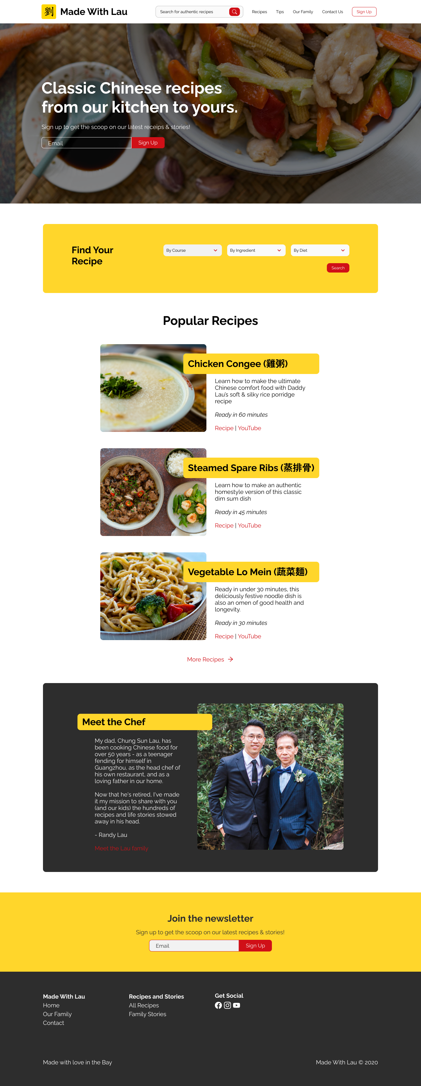
As the channel continues to grow and content builds, users have voiced frustration over the navigation and discoverability of the growing amount of recipes. There was a clear need to redesign the webpage through information architecture and integration of new recipe navigation features. MWL's owner approached me with the opportunity to help with the responsive webpage redesign on desktop, tablet, and mobile.
Project Scope
My role as a design lead on this project required a range of responsibilities including:
- UX Design
- UI Design
- User Research
- Information Architecture
- Design Articulation
- Stakeholder Management
- Implementation Support

As I sat down with the client/stakeholder and creator of MWL to discuss the redesign, some key business goals for the recipe pages were communicated.
- Visual stimulation aligns with brand and maintained in recipe page
- Achieve higher degree of clarity and conciseness in recipes
- Achieve higher conversion to sign ups
- Achieve higher discoverability of recipes within webpage
Given the scope of the project, some constraints were communicated to the stakeholder to set expecations:
- Focus of project on the recipe flow
- Design implementation will be part of future phase
- Adherence to existing design system will be critical to maintain branding
Project tools used include:
The entire design process spanned over ~3 weeks.
Research
To uncover the usage pattern of MWL's users and identify mutual goals between the business and the users, we decided to craft a research plan that centered around user interviews (the first time for MWL) and secondary research by analyzing design patterns from direct and indirect competition, as well as general research into market landscape and trends. Another key purpose of the user interviews is to investigate and validate that the recipe navigation problem the client approached me with are in line with user issues identified through the research.

Research Insights
Over the course of our research, three key insights became critically consistent:
- Two primary groups of users...
- User environment dictate users needs...
- Users actually understand business goals, but...
Research Insight 1:
Two primary groups of users... and both want to get through to the recipes
User interviews were conducted with existing subscribers of MWL through virtual 1:1 user interview sessions. The goal of the primary research is to gather behavioral data on the goal and needs of the users for the recipe page. I conducted eight 30-min interviews with existing users over Zoom.
Two group of primary users emerged from the conversations, namely the "Social Foodie" and the "Homecook". Edge users were also considered in our redesign, however given the current scope of the design project, we have not based on redesign around edge users. I then created two personas from the majority user cases to help create subject(s) to the redesign. The personas became critical in maintaining an user-centric approach by stressing empathy and relatability in the remaining design phases.

Additionally, the primary research uncovered key user needs for recipes that can be also supported by the secondary market research, two key takeaways in user behavior:
- Over 50% of homecooks use recipes from bloggers
- Almost 90% of homecooks go online for recipes
Research Insight 2:
User environment dictate user needs... and it is all referencing the recipes
The stakeholder has hypothesized that most users use the recipe page to reference a recipe previously viewed on the YouTube channel. Through the confirmation from 6 of 8 users interviewed, we were able to validate that assumption that users primarily visit the recipe page only after seeing the video recipe. Although detail and background information may be valuable information for the user the first time across the recipes, their needs change when visiting the recipe page the second time.
In addition to the user flow, the research also showed that user environment can also dictate their need for recipe information. For example, when a user at a grocery store procuring ingredients for the recipe, they are primarily focused on the ingredients list of the recipe. Once the materials have been purchased, that same user may have the need to revisit the recipe summary to familiarize with the steps before actually cooking. Finally, the user will go through the step-by-step instructions during the actual cooking process.
It became evident that users tend to access recipe information in various physical environments, stressing the need to focus on a truly responsive webpage design, as users tend to enter into the recipe page through different portals at various steps of the flow. To identify these user patterns into actionable insights, I have created an empathy map to keep track of the repeated feedback received from different users.

Research Insight 3:
Users actually understand business goals... but have little patience for them
Through the research conversations, it was clear that users are generally familiar with the business model or recipes blogs, and because of that, ads, purchasing links, and redirects are expected. As long as these business needs do not directly interfere with the users' task, users can tolerate them. Finding that middle ground will be critical in achieving the project goal (the middle section where user and business goals meet (see Venn diagram below).

overlapping project goals
It is important to note that because the users researched are existing users of MWL and familiar with the brand, they are more empathetic to the creator and his goals to monetize the webpage. The same cannot be said to new users that may be agnostic to the brand.
Define
From these research insights, we revisited the project goals to define the problems we hope to address through the redesign. The define stage of the design thinking process helps distill the research findings into specific problems to solve for, in this case, to reduce the amount of friction users encounter as they access specific recipe information on the webpage.
Problem 1:
Long form recipes present TMI to users but helps webpage monetize
“I got so frustrated scrolling for so long I just said forget it, I am not interested anymore!”
- Nancy W.
existing MWL User
Depending on the physical environment the user is in, the type of device used, and the familiarity of the user with the content, long form recipes create unnecessary friction on a recipe page. In other words, users found long form recipe pages to be Too Much Information (TMI). In the user interviews, some users voiced frustrations over the amount of unnecessary information typically presented on recipe pages. However, long form content does present monetization opportunities for the webpage owner, something that the stakeholder has stated as a business goal.

In understanding the amount of content to display on the recipe page, and the order in which the information is presented, it was vital to consider the tradeoffs between the pros and cons of long form recipe content:
Pros:
- Storytelling provides context and allows users to get to know the recipe creator and share in the journey
- Differentiates the creator by allowing users to identify the palette and flavors of the creator
- Richer content helps with SEO by better defining the recipe post
- More advertisement impressions
Cons:
- Inconvenient for users
- Difficultly in navigation
- Cognitive overload
In the stakeholder interview, it was stressed that the webpage should not only serve as a place for recipe repository but also an extension of the MWL brand and a platform for monetization.
Problem 2:
(Lack of) recipe searchability
In line with the problem with content management, as the number of recipes continue to grow, it is critical to develop an infrastructure that allows the user to navigate recipes through a new recipe search function.
The lack of search requires users to manually scroll through the recipe list to identify the specific recipe they are looking for. Currently the recipes are listed in order by recency, but with one recipe added a week, we are expecting to soon reach to a point where the existing infrastructure no longer supports the amount of recipe content. On average, users researched indicated that pages with more than 20 recipes will be difficult to navigate. Given the current cadence on when new recipes are uploaded, we will reach the breakpoint in two months.

Problem 3:
Accounting for multiple entry points, all with different experience levels with the content
Users generally land on a recipe page through two entry points 1) from YouTube recipe link and 2) search engine results link. Depending on the point of entry, a user may/may not be familiar with the recipe and require more/less context. Prior to the redesign, each recipe page contains background information on the MWL brand, the chef, and the specific dish. Although this information is valuable on a standalone basis, as most users are directed to the recipe page from the YouTube channel, they have already seen the same information in a separate medium. This background information becomes redundant and a cause for user frustration.
User Point of View (POV) and How Might We (HMW)

Brainstorming
The defined problems further revealed that users are most concerned about navigation efficiency and conciseness of the recipe information. When users are on the go, reduced friction in navigating can really win them over and build trust. Through a series of brainstorming exercises including How Might We statements, mindmapping, and rapid brainstorming, building blocks to the redesign solutions were created.


Strategize
To overhaul the recipe discovery process, we have narrowed down the possible redesign to include a new recipe search, recipe filter, and recipe page information hierarchy. A product feature roadmap in Airtable helped prioritize these features based on each feature's impact and effort.

These product features were further integrated to the redesigned webpage, and an updated site map was created to visually layout the new infrastructure of the sight, with a more robust mapping of the new recipe flow.


Keeping the user research in mind, we have then designed a user flow that keeps consistent with the use cases and user environments my research participants demonstrated a pattern of. The creation of a user flow helped empathize with the typical journey a user will go through to achieve their goals. Confronted with decision tresses and various points of entry, this user flow depicts the possible journeys a user will take to complete the goal locating a specific recipe they are looking for.

Design
The strategy phase gave way to multiple design solutions to help accomplish our persona's user goals.
Design Solution 1: Recipe Search
The first and perhaps the most familiar solution is the implementation of recipe search. The power of search is that it is highly intuitive to most users, and with growing amount of content leading to more relevant search results. It also provides the user with a greater degree of freedom without the need to learn a new UI. The integration of search is a key component of the webpage in the current state and a must-have component for the future state.
We included an autocomplete function in the design to aid users through the search and help users recognize, diagnose and recover from errors.

Design Solution 2: Recipe Filter
In some cases, search may not provide enough context or structure for select users. Users who want to browse through the available content will find the experience through filter more exploratory and complementary to the recipe search function. Additionally, some users' mental model require a more suggestive filtering process to assist in navigating what they are looking for, especially if the recipe may be difficult to recall.
The number of filters is also important to consider as more filters can increase cognitive load while not necessarily yielding more precise results. Given more resources and time, a card-sorting exercise would be helpful in understanding typical recipe groupings according to users. However, given the limited resources available for research, we based the filtering categories from the user research (and validated through usability testing).

Design Solution 3: Recipe Page Information Architecture
When we think about the redesign of the actual recipe page to better serve our user's goals to locate information in an intuitive and efficient way, it is critical to refer back to the principle of designing by matching design systems and the real world In the context of a recipe page, it was important to emulate a cookbook layout and parallel the typical cooking process of procuring ingredients and materials before any cooking can begin. In both cases, users need to see the summary of the recipe clearly and succinctly, without distractions.
While it was critical to keep the video and imagery consistent with the MWL brand, the background information can feel redundant and distracting.
Reviewing user stats from Google Analytics, we can confirm that the typical flow of traffic comes from social and YouTube, which implies that users have already been exposed to the video content and now look to the recipe page as a reference.


Test and Iterate
The wireframes were converted into mid-fi prototypes to gain feedback from users on the design iterations. We made the decision to go with mid to hi-fi wireframes for testing as the users are already familiar to the existing webpage and wanted to test with something they are familiar with. We hesitated to test with low to mid-fi prototypes to prevent additional user confusion, paying mind to the fact that the participant is likely new to the Invision prototype tool and adding content in an unfinished state may cause further confusion while testing.
Link to prototype here.
Usability Testing
As evaluative research on the redesign, usability testing was conducted moderated over Zoom with the user participant completing defined tasks on the prototypes via Invision. The main goal for the usability tests is to ascertain if users find the recipe navigation redesign usable, intuitive, and delightful. Any slips and errors were observed and recorded for synthesis as a next step.

test Insights
To complete the task of identifying the ingredients required for a specific recipe, 4 of 6 participants went directly with the keyword search feature and bypassed filtering process.
An affinity map was created to categorize feedback for pattern observations, of which three key insights concerning recipe navigation resulted.
- Of the four participants who went directly with the keyword search feature to locate the recipe based on the task prompt, all four suggested that keyword search is more intuitive and using the filtering function required additional learning that may be cumbersome or unnecessary.
- 4 of 6 participants found the categorization of the recipe filters to be inconsistent to their mental models (for example, a fried rice dish can be categorized as a main dish to some and side dish to others).
- The inclusion of sidebar navigation links were unanimously lauded as a helpful addition to allow for users to orient where they are on the recipe page.


Final Takeaways
We set out on this 3-week project to better understand MWL's users' behavior, flow, physical environments and mental models as it relates to interactivity with the MWL webpage. Specifically, what are the user's goals and use cases for a specific recipe, and how do users navigate to a recipe they are interesting in?
Through a user-centric approach to answering these questions, we came away with valuable insights and design solutions that met users' needs while still achieving business goals communicated at the outset. Despite the constraints of time and scope of work, we were able to successfully design a new recipe search function, a new recipe filtering function, and revamped the information architecture to better accommodate the users' goal while reducing friction. We were also able to uncover two primary groups of users and work with the stakeholder to handle the challenge of accommodating existing and new traffic that may or may not be familiar to the recipes.
The final step to this project is measurement of success, which continues to be in progress.
MVP and Implementation (Future State...Stay Tuned!)
The design deliverables were shared with the client/stakeholder and implementation is currently in progress. Given the limited development resources available to make these design changes, the higher priority revisions have been addressed first with lower priority revisions to be addressed in future state.

As changes are made, we are eager to track the increased engagement on the webpage through the implementations of these solutions. Using Google Analytics, we are able to analyze improvement in key metrics (such as # of new users, session duration, bounce rates, etc.), and will continue to do so until all of the redesign has been implemented... stay tuned!