.png)

Equipping real estate investors with the tool to discover the best opportunities
The market for real estate investment properties is notoriously competitive. Savvy investors win because they are able to discover great opportunities and act on them faster than their competitors.
For homebuyers, the home search process is relatively simple: confirm a property 1) has a profile that fits their physical needs, 2) suits their style, 3) is in a good neighborhood, 4) is within a budget that they can afford, then go inquire!
But unlike homebuyers searching for primary homes, identifying a great investment property requires an understanding of the property’s income potential. An investment property is only attractive if it can generate adequate income relative to the cost to acquire it.
To determine the adequacy of this income, the current tech stack available to the real estate investor includes far too many tools.
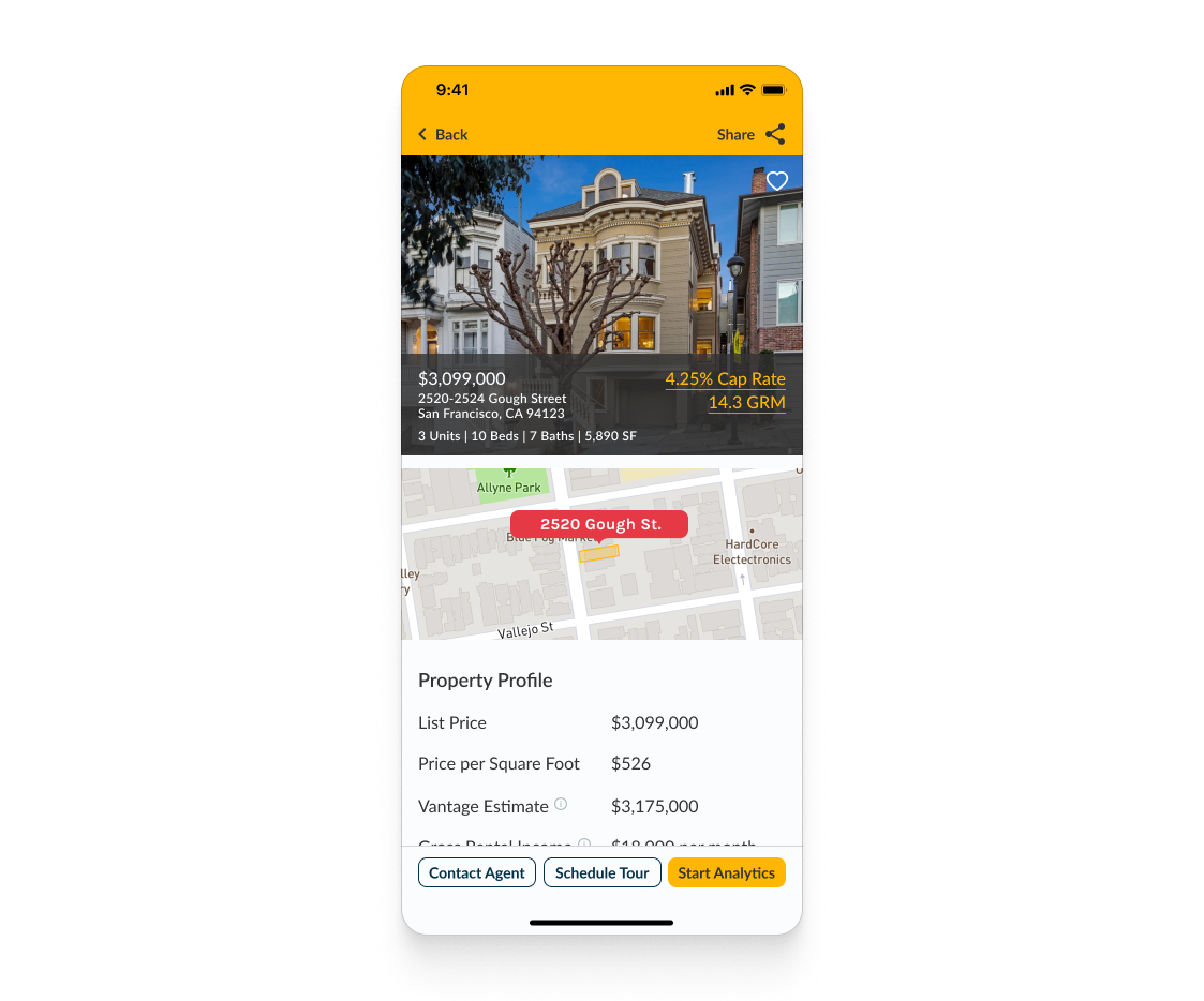
I took on this solo project to design a mobile app to simplify this discovery process, to allow investors to quickly analyze properties and pursue listings that meet their investment requirements, all contained in a single app on their phones.
My goal was to design a real estate investment app that increases productivity and improves the property discovery experience.

Finding the right real estate investment property can be a fragmented process. To search and then analyze a property to see if it is even worth pursuing, the investor needs to juggle a myriad of different real estate apps, spreadsheets, reports, listing sites, etc. And often times, investors are jerry-rigging tools designed for primary homebuyers to make investment decisions.
In order for an investor to find a great investment in a scarce market, increased productivity can be the differentiator between a deal won or lost.
Current real estate apps only help users search properties based on physical profiles like location, size, and price, but neglect to offer any insights on the properties as investments. The burden is on the investor to plug numbers into spreadsheets, log in and out of multiple accounts, and do basic market due diligence on their own.
Not only does this create cognitive load for investors to manage multiple platforms, but it requires needless data entry, not to mention all the time lost from unnecessary context switches.
Some investors looking to shortcut this process may instead reach out to the sellers or listing agents prematurely, wasting time inquiring about properties that don’t meet their investment needs.
To uncover the roadblocks real estate investors are facing, I conducted two types of formative primary research to understand how Vantage’s potential users are finding investment properties.
User surveys are helpful in getting quantitative feedback from users across a more statistically significant sample that can be used to better guide design decisions.
I conducted a Google survey with 14 real estate investors and agents. The results helped me quantifiably measure investors’ property search process, how satisfied they are of the current online marketplace tools, and which specific metrics users rely upon to signal a good investment.


In addition to these survey results, I interviewed a group of real estate investors to get a more in-depth understanding of the needs based on their mental modals, and how they feel about the current process.
In all, I interviewed five people with varying degrees of real estate investment experience. The goal was to understand the common challenges working with the available tools and any workarounds they use to get the job done.
From the survey and interview responses, there is a high level of appetite for an improved process of finding properties that meet each user's investment criteria. The common pain point is the inability for users to analyze properties quickly, to determine if a listing is worth pursuing.
Knowing that some level of analysis within the app is required, how might we integrate property analysis within the search process in order to help users determine if a listing is worth pursuing?
More specifically from the interviews, how do we integrate search based on investment criteria (Interview Insight #3), income information from rental listings (Interview Insight #2) on a mobile app (Interview Insight #1)?
To visualize the pain points and frustrations that a real estate investor encounters throughout the current property discovery process, I developed a customer journey map that highlights their actions and emotions across various touch points.
The diagram was foundational to empathize with users and uncover the opportunities to improve their experiences across the entire journey.

The major drop off occurs when the user realizes there is missing information and is forced to switch between multiple apps, tools, and documents to complete a property analysis just to see if a property meets the minimum investment requirement.
The double diamond is a ubiquitous framework to UX design. Likewise, the path of a real estate investor discovering an investment property follows a similar pattern.
Investment criteria often starts off specific and then diverge during the search phase. Qualified listings then converge again during “rapid” analysis to determine if listings meet the minimum return requirements. Qualified properties are then compared, with the best opportunity(s) distilled down for pursuit.

Current real estate apps like Redfin, Zillow, Realtor.com do a great job in the initial search and exploration process. However, any type of investment analysis must be done outside of the platform. Vantage allows users to perform the entire discovery process on its platform. Users can analyze and compare investment properties before reaching out to the listing agent. Increased productivity ultimately helps users win more deals.
With the problem statement and research insights in mind, I wanted to develop some guiding principles to act as guard rails during my design process.
The path to identify a property within an investment criteria can be broken down into three phases: 1) Search, 2) Analyze, and 3) Pursue. Success can only be achieved when all three stages are complete.


To incentivize users to complete the Call To Action when they come across a good opportunity, I needed to communicate a sense of value, scarcity, and urgency on the listing.
I designed and tested three different options with the potential users:
The responses on the first option showed that a “hot listing” indicator can appear biased or leading.
The second option to showcase return metrics more prominently required a match in how the users prioritize the importance of the metrics, which sometimes can be misaligned.
The investment score option was the most well-received. The score quickly rates an investment based on a scoring system that users are familiar with, quantitatively assigning a value to the opportunity.

The initial sketch and final design on the Vantage Investment Score, a composite rating of the listing relative to other properties in the competitive market. A high score indicates a quality investment and creates additional motivation for the user to take immediate action.
Through moderated usability testing with actual investors and realtors, a common obstruction was the discoverability of the property analytics tool. Once the test participants found the analytics tool, they were impressed with it. It became clear that the tool discovery and page orientation needed a revamp.
“This property analytics page is super useful,
just took me awhile to find this info.”
- Brad J. (Realtor & Investor)


One of the truly exciting parts of building an end-to-end mobile app is the creative freedom to design a brand that embodies the product and captivates the user. Reliable, approachable, and modern were the key brand attributes in Vantage’s style guide development.
.png)
Early logo explorations
Final Vantage logo

By using a recognizable user interface with type and color choices that embodies a clean, modern, and approachable tone, I wanted Vantage to make the initial impression of being trustworthy and sophisticated.


Leveraging familiar interactions to allow users to gain immediate recognition for basic functions such as search, filter, and navigation.
Creating Vantage from zero to one presented an opportunity to build an entire component library with the makings of a robust and dynamic design system. The design system allowed me to quickly deliver hi-def wireframes and prototypes for iteration.

The library summarizes the original components and variants I created for Vantage, which was closely referenced from the iOS Human Interface Guidelines and Material Design.
This MVP prototype is the latest of the ongoing iterations to demonstrate a user flow through the 3-phase investment discovery process of search, analyze, and pursue. The prototype allows the existing user to log in, browse through properties in a specific neighborhood and reach out to the listing agent of a specific property that meets the investment criteria.
One of the key challenges of this project was delivering technical information that a user needs to complete the task without it being overwhelming. With this in mind, my reliance on the usability tests to ensure the copy and information hierarchy of the app match with the users’ comprehension were critical.
With an app that serves as an analytical tool, the inclusiveness of the diversity in users’ mental models and vocabulary becomes a critical step in maximizing user satisfaction across a broad spectrum.
Extending on the “must have” features on this MVP design, a couple of “nice to have” features on the roadmap includes a more robust onboarding process and investor profiles.
A complete onboarding flow allows for new users to get familiar with the app but also the terminology used. Currently, many of the technical definitions are presented as information modal dialogs. With a skippable onboarding flow, the education can begin at the outset of the user experience. Reducing modals to key reminders can allow for more seamless interactions throughout, lowering distractions and user dropouts.
User profiles serve multiple purposes, from data generation to the increase of the app's stickiness. For Vantage, investor profiles allow users to save their investment criteria and analysis assumptions within the app for easy and consistent access.
For this app to be widely adopted by real estate investors, it is important to establish some key usability metrics to help define engagement success.
Event tracking monitors how users engage with important features on Vantage. The three most important events are when users 1) make changes to analysis assumptions, 2) save searches, and 3) hit the CTAs to engage with listing agents.
The number of screens viewed (and average visit) is very telling especially in the context of property discovery and search processes. The number of screen views can demonstrate the level of interest within the search process, indicating user satisfaction with the search tool.
This rate is especially important to track during user testing. As the app is still being iterated on and expanded upon, one of the key testing metrics will be the rate in which users complete tasks successfully and in full.
Vantage is designed to empower real estate investors with a tool that increases productivity, allowing users to analyze and pursue meaningful deals more efficiently.
This project has allowed me to develop a user-centric solution to a set of validated user problems. Along the way, the challenges I came across helped me regain focus to increase the discoverability of the main features of the app, and iterated on designs to emphasize value and urgency.
I came into this concept project wanting to push myself to design an end-to-end mobile app, create a marketable brand, and build the foundations of a design system. And came away with a better understanding of the problem space, a great deal of learnings, and a viable product that I would be proud of possibly launching one day!

.png)